Brands renewed

Under Consideration’s Brand New is a blog that critiques corporate and brand identity work. Over the years that I’ve been reading its reviews, I’ve noticed that the work I tend to appreciate most is that which seeks to refine an existing identity rather than reinvent it wholesale. While a logo may still receive a few nips and tucks, much of the work is instead focused on updating the accompanying design language, weeding out those areas where inconsistencies have crept in. Here are a few recent examples:
-
On the occasion of the 100th anniversary of its crane symbol, Lufthansa undertook the subtlest of brand refinements. Alongside a tweak to this symbol and review of its type system, emphasis would now be given to a darker and more elegant blue, with its distinctive yellow demoted to that of a more functional accent.
-
Stockholm Design Lab tweaked Ericsson’s ‘econ’ icon to the nth degree – 18.435° to be precise – so that it would align smoothly with the pixel grid and appear sharper on screen. The change was accompanied by the introduction of a new brand typeface Hilda, also optimised for digital environments.
-
Pentagram’s identity refresh for American Express again saw practically indistinguishable logo tweaks, but they also introduced a shorthand version to be used in situations where space is at a premium.
-
When North was asked to review Tate’s visual identity, rather than replace the dynamic logo designed by Wolff Olins in 2000, they instead opted to refocus and refine it:
For us to propose getting rid of the identity system entirely would be irresponsible and a selfish act as designers. Instead, we built on the existing brand equity, refreshed and strengthened what was working well.
I wish more designers would take such a selfless approach. While I could spend hours studying such refinements, I have nothing but admiration for the team at INSTID that created this new identity for Irkutsk, a Russian city in southeastern Siberia:
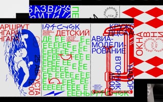
Irkutsk identity presentation
Watch on vimeo.com (opens in a new tab)
Possibly inappropriate, undoubtedly nonconformist and certifiably bonkers, part of me wishes I could dream up something as loose and unrestrained. This project confirms my suspicion that objectively, good design is about a consistency of execution, and somewhere within the madness of this identity, there is an element of coherence. Similarly, maintaining a degree of consistency is the reason why many established and trusted organisations will choose to refine their identities rather than replace them.